
The Best Logo in Single-A Baseball & The Brain Behind It
Graphic Design is my Passion


After putting far, far too much thought into it, I am declaring the Rome Emperors’s logo the best in Single-A baseball.
Sports branding comes with difficult mandates, traditionally speaking. The team name must sound somewhat threatening or tough, and the logo must appear that way as well, or at least appear sleek or muscular in some fashion.
The team gets bonus points if the mascot or logo feels in some way essential to the area the team represents. The Detroit Pistons is an obvious example. It’s a car thing, and Detroit is the car capital of the world. The Detroit Red Wings name has nothing to do with cars, but the logo incorporates a wheel into the design, so you can’t say the brain trust behind the 1932 rebrand from the “Detroit Falcons” wasn’t trying.
The Rome Emperors are somewhat new to baseball. An affiliate of the Atlanta Braves, they were the “Macon Braves” from 1968 until 2003, when the team moved to Rome, Georgia (Population: 38,111 good ol’ boys), and became the “Rome Braves.” The team rebranded to the Rome Emperors, a play on the emperor penguin, on November 16, 2023.
As a gift to me on what was my thirtieth birthday, they started their press release announcing the change with this truly beautiful lede paragraph:
Rome, Georgia, got its name because, like its Italian counterpart, the city was built within seven hills and the rivers that run between them. At a ballpark event on Thursday evening, Rome’s Minor League Baseball team further solidified the connection between the two seemingly disparate locales.
The press release also notes that while there are no Emperor Penguins in Georgia, there also aren’t any Bengals in Cincinnati or Grizzlies in Memphis.
David Lane, the team’s general manager, explained that they didn’t want a “a Little Caesars-looking dude that walks around with a golden metal helmet.” I guess nobody said anything about an extremely smug Little Caesars-looking penguin with a baseball bat.
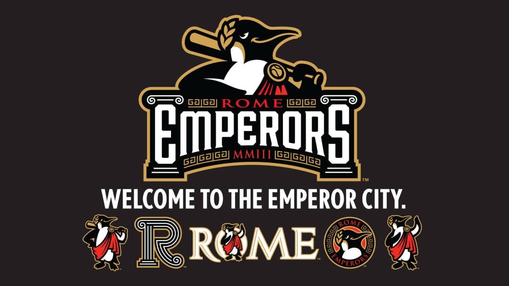
What makes this logo so brilliant is how deeply unserious it is. Unburdened by the expectations of toughness and muscularity, this minor league organization that absolutely no one reading this has ever heard of until now can exude personality.
Contrast this with other recent rebrands which retreat from American sports’ propensity for what we’ll diplomatically call “uncomfortable” usage of Native American iconography. Instead of the Cleveland Indians, we have the Cleveland Guardians, which implies there is something worth guarding in Cleveland. Instead of the Washington Redskins, we have the Washington Commanders, which implies someone is actually in charge of something in Washington D.C.
In reading about the Rome Emperors, I learned that Studio Simon, a design agency based out of Louisville that describes itself as “one of the leaders in sports brand identity development,” designed the logo.
The company’s bread and butter is minor league baseball, though they worked on with the AHL’s Milwaukee Admirals to update their Cartoon Network-looking logo into something a little more sleek and with the NFL on Super Bowl logos back when Super Bowl logos were allowed to have personality.
Their website states that they’ve “100 baseball franchises in more than 20 different leagues across the United States and Canada on the development of difference-making brand identities designed to capture the unique flavor of minor league baseball and the cities these clubs call home.”
Do not let the corporate language fool you. The logos shared on this page are all extremely fun, sharing the Rome Emperors’s penguin’s knowing delusion of grandeur. This one is my favorite.

Studio Simon is headed by Dan Simon. He has given very few interviews, but in one 2017 interview with Sports Business Journal, he commented very briefly on the camp nature of minor league logos.
Quirky, offbeat and unexpected is part of the minor league experience, and it is great when team names and logos reflect that. Inevitably, however, the can-you-top-this approach goes too far… And the result was that, in the eyes of many, it made minor league baseball look like a joke. Just as outlandish behavior will always get attention, so did these names, but it was the wrong kind of attention.
I have a tremendous amount of respect for Dan Simon’s work, but I would offer some pushback. In 2022, the Modesto Nuts averaged 1,259 attendees per game in a ballpark with a capacity of 4,000. Any attention is the right kind of attention.